
Vested
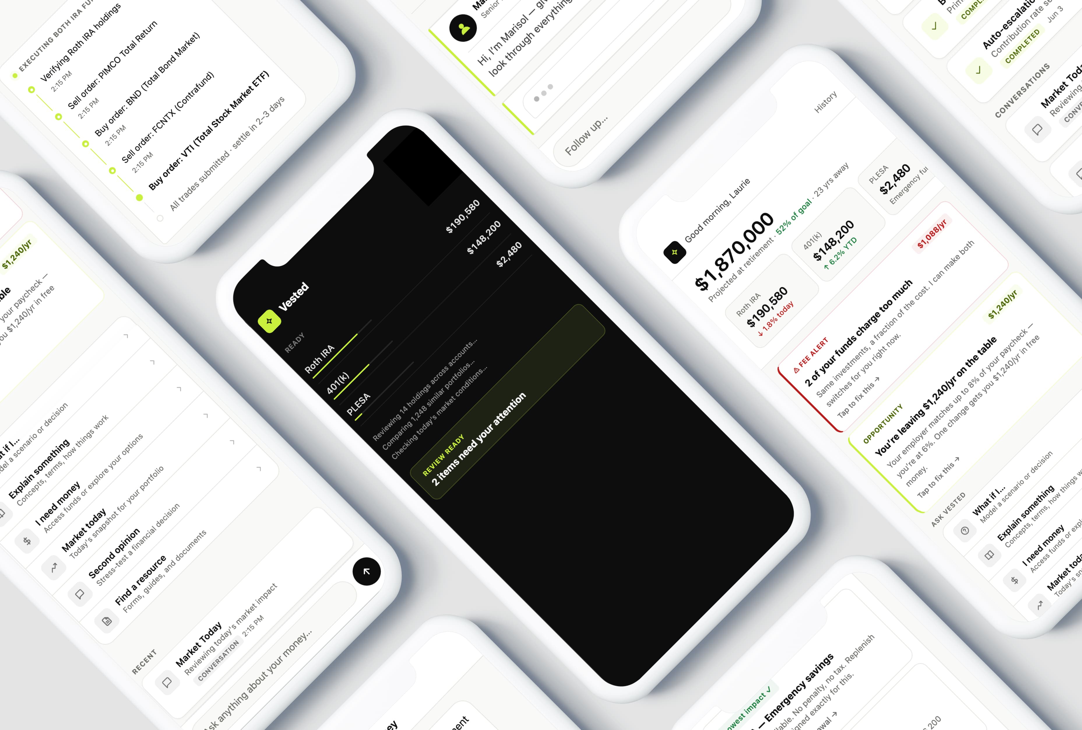
What would a financial app look like if it actually helped you make a decision — before you had to ask?
Proactive
Surfaces insights before you ask
Calibrated
Knows when to say 'I'm not sure'
Human-in-loop
Routes to a CFP when it counts
The Challenge
Most personal finance apps are accurate and useless. They show you your balance. They tell you what happened. They don't tell you what to do next, and they never connect your present decisions to your future self. The challenge wasn't building a better dashboard — it was building something that could actually help someone make a financial decision.
Approach
AI gave me three things that would have been impossible to build otherwise: proactive pattern recognition across accounts without the user having to ask, personalized math surfaced at the exact moment a decision is being made, and calibrated confidence — an advisor that knows when to say 'I'm not sure' and when to bring in a human. Every design decision in the prototype was an answer to one question: is this building trust, or performing it?
The Problem
Most personal finance apps are reactive — you open the app, you see your balance, nothing happens. The more sophisticated ones notify you after something has already occurred. Vested was built on a different premise: that the most valuable moment in personal finance is before the decision, not after. The design challenge wasn't just surfacing the right insight — it was doing it without being reckless. A financial AI that hedges everything is useless. One that overpromises is dangerous.
The goal wasn't to replace a financial advisor. It was to make the space between 'I should probably think about this' and 'I actually did something about it' much, much smaller.
Why This Needed AI
There are things this product does that simply weren't possible — or were prohibitively expensive — before large language models. Four in particular shaped the design from the ground up.
Without AI
User opens the app
On their own initiative
Sees a static balance
No patterns flagged, no context
Doesn't know what to look for
The product just watches
Seeks help or misses it entirely
Phone call, Google, or nothing
With Vested
AI scans and surfaces an insight
Monitors your accounts, detects patterns, and flags what you'd need a financial advisor to catch — all before you ask
You engage with it
Arrive at a decision point you didn't know to look for — not just faster, but at the right place
In scope · confident
Complex · uncertain · requested
Resolved by AI
AI answers or executes
Responds, runs calculations, or completes approved actions
Escalated
Needs a human
You ask, or AI routes automatically — either way
Human in the loop
CFP joins the conversation
With full context already loaded
- 01Proactive pattern recognition: Watches across accounts and surfaces insights as prompts — no user query required. This isn't a notification; it's the product doing its job.
- 02Personalized math at the decision point: When someone asks 'what if I retire at 60?' they shouldn't get a generic article. They get a calculation built from their actual accounts, surfaced right now in the conversation.
- 03Calibrated confidence: The AI says 'I'm not sure' when it is, and routes to a CFP when the question warrants one. Making the system's uncertainty visible is what makes it trustworthy.
- 04The conversation as the interface: A user asking 'am I on track?' is asking something no dashboard can answer — the question is imprecise, emotionally loaded, and deeply personal. Natural language is the only interface that works.
The Design Problems AI Actually Creates
Building an AI product means inheriting a new class of design problems — ones without established patterns, where the wrong answer has real consequences. These four shaped the design more than any interaction detail.
- 01Hallucination containment: The model will occasionally state something false with confidence. You can't solve this at the design layer — but you can design so users catch it before acting on it. Every AI output in Vested includes an auditable reasoning step: 'here's what I looked at.' Visibility is the defense.
- 02The confidence calibration problem: 'I think' and 'I know' are completely different things in financial advice. The challenge was making confidence legible without a disclaimer. The color grammar handles it: chartreuse marks AI-generated content; the rest uses a conventional financial palette. One rule. Zero cognitive load.
- 03The personification trap: Every design instinct says give the AI a name. A named character creates expectations — and when it fails, the failure feels personal. In Vested, the AI is simply 'your advisor.' No name. No face. Just a job description.
- 04The floor problem: Every feature I didn't build was a deliberate choice. No 'what should I invest in?' flow — not because it's technically hard, but because it crosses from decision support into decision-making. Deciding what the AI declines to do was the most important design work in the project.
Try It
The prototype is fully interactive — start from the dashboard, try the AI chat, ask about your accounts, or type 'talk to a person' to see the human handoff.
What This Prototype Doesn't Do
This is a design prototype, not a product. Honest accounting of scope before you read anything else into it.
- Connect to real accounts — all data is simulated
- Navigate a regulatory environment — FINRA, SEC, and state regulations would significantly constrain much of this interaction design; compliance isn't a layer you add at the end
- Build trust over time — the prototype starts with a pre-populated history, but a real product would earn every one of those sessions
- Run on a real model — AI responses are scripted, not generated; the prototype demonstrates the interaction pattern, not the underlying intelligence
- Handle adversarial users — a production AI needs guardrails for manipulation, prompt injection, and misuse that a design prototype doesn't simulate
Key Design Decisions
Six decisions shaped how this prototype feels — and each one was a direct answer to the same question: is this building trust, or performing it?
The scan as a contract
The opening animation isn't decorative — it's a promise. The AI scanning your accounts and surfacing one specific insight before you've done anything establishes the product's fundamental contract: it works for you, you don't work for it. The first screen is the only screen that sets the relationship.
Explainability as the CTA
The original instinct was to make AI reasoning collapsible — show the answer, let users tap for the math. When the reasoning was visible by default instead, users were far more likely to act. The explanation became the conversion mechanism, not a transparency add-on.
A color grammar for confidence
Chartreuse — the single brand color in an otherwise conventional financial palette — marks AI-generated content. Users know immediately whether they're looking at a fact from their account or an interpretation from the model. One rule. No disclaimer required.
The handoff as a step forward
In most products, routing to a human feels like losing. In Vested, when a question needs a CFP, Marisol Rivera joins the thread with context already loaded — acknowledging the transition rather than hiding it, because the seam is exactly what makes both sides of it trustworthy.
Market data as ambient context
The dashboard includes a market snapshot not because users need to trade, but because their accounts live inside market context. Placing it at the same visual weight as balances — not in its own alert card — says: this is context. Use it or don't.
Declining gracefully
When a question falls outside the system's scope, the AI acknowledges it, states the limit briefly, and offers a real alternative. Designed to feel like a competent colleague saying 'that's not my call' — not a chatbot hitting a wall.
What I Learned
The most important design decisions in this project were about what the AI wouldn't do. Every feature I cut, every question I decided the system should decline — that work shaped the product more than anything that made it into the prototype. An AI that tries to do everything earns trust for nothing. I also learned that AI product design isn't a new genre — it's the same problems with higher stakes. Is this honest? Is it legible? Does the user understand what's happening and why? The difference is that opacity tolerable in a SaaS tool is dangerous in a financial one. The human handoff was the most interesting design problem, and the one that required the most care — because users read that moment for signals about whether to trust the whole system.
Outcome
A high-fidelity interactive prototype demonstrating an AI financial advisor that acts proactively, hands off gracefully to human advisors, and treats confidence calibration as a feature — not a failure state.
Proactive
Surfaces insights before you ask
Calibrated
Knows when to say 'I'm not sure'
Human-in-loop
Routes to a CFP when it counts